Two George’s in New York
I had mentioned to friends and students that they should see the exhibitions of Giorgio Morandi at the Metropolitan Museum and George Tooker at the National Academy. I suggested that they be seen together. A good friend asked me what the two exhibits had in common. I reached for various answers, such as the common interest in form, their innocence, their openness to modernism, a certain pared down depiction of reality and the physical proximity of the exhibitions. Finally, I realized the significance to me of their name – “George.” My mind somehow links these two artists together. Perhaps some future insight will make this juxtaposition clearer.
“Nothing is more abstract than reality.”
“I believe that nothing can be more abstract, more unreal, than what we actually see….Matter exists, of course, but has no intrinsic meaning of its own, such as the meaning we attach to it. Only we can know that a cup is a cup, that a tree is a tree….I have never intended to give the objects in my still life arrangements any particular meanings.”
Giorgio Morandi
A tender and extreme innocence and quest inhabits the magical work of Giorgio Morandi that was on exhibit at the Met. The paintings are tough-minded and yet warmly intellectual, diffident and hermetic.
One is struck by the immense variation that exists within a seemingly narrow range of subject matter. When viewing this body of work, we are taken on a long voyage which involves a searching contemplation. There is a strong interest in space, form and architecture.
A duality exists as objects are depicted with great structural probing and yet there is also a certain awe, lack of strategy and no sense of rendering to Morandi’s work. The lines, which sometime waver and appear out of focus, speak to the overall innocence of the art.
The paintings, simple and complicated at one and the same time, never lose their mystery. Actually, they are as mysterious as they are simple and locate themselves on the opposite end of the spectrum from illustration. They exist for themselves.
Matvey Levenstein, in December’s Art in America, writes movingly of Morandi, quoting the artist – as a:”believer in Art for Art’s sake rather than in Art for the sake of religion, of social justice or national glory. Nothing is more alien to me than an art which sets out to serve other purposes than those implied in the work of Art in itself. I ….have never set out to illustrate anything at all programmatic in my work.”
Levenstein quotes Isaiah Berlin on the “Naïve” artist as being rare in modern times. For them “art is a natural form of expression; they see what they see directly and seek to articulate it for its own sake, not for any ulterior purpose, however sublime.” Shiller writes of the naïve poet that “the object possesses him entirely….He is concealed by his works like God by the world He has created. He is the work. For the work is himself.”

George Tooker’s recent retrospective at the National Academy shares a purity and innocence with Morandi. The work is highly human and yet very open to modernist ideas of space and psychology and composition. The paintings use art historical imagery and yet refresh and invigorate traditional figurative directions to depict a contemporary psychology. Detachment and distance is frameworked within an architectural setting. Our solitary presence is invoked, a lonely journey to find our truth, possibly on planet Earth, or as a metaphor within our urban malaise.
Tooker’s painting, The Subway, is a deep and striking work, upending, disturbing and relentless in the repetition of form and movement. We are trapped somehow in this underground world, fated to pursue and search out meaning within some faraway and irrational world order.
Similarly, The Government Bureau, shares Tooker’s repetitions of form, architecture, creating a foreboding and weirded- out presence. As with The Subway, the influence of early Italian art, perhaps Piero, is clear but the work is charged with a modern and existential presence. In certain of Tooker’s images, we are left to our own devices within a less and less rational and certainly detached world.
This dream-like element shifts a bit as the compositions and mood changes. Singular figures appear or are shown with still life. Or, sometimes they are depicted listening to themselves. We are brought onto Tooker’s stage and world and presented with a highly human, yet sometimes disturbing world. A formidable presence, within the figurative tradition, both traditional and modern, is strongly exhibited.
“I am after painting reality impressed on the mind so hard that it returns as a dream, but I am not after painting dreams as such, or fantasy.”
George Tooker

On December 31, I revisited the Tooker show with my grandson, Adrian, who is seven years old. It was the second exhibition I had taken Adrian to see. The first was of prints of Albrecht Durer at the Museum of Biblical Art. I knew that Adrian would respond to Tooker’s work….or at least I had a strong hunch. We stayed for two hours and were both fully absorbed. Adrian copied some of the work and did a wonderful drawing of Pot of Aloes. I mentioned to him that the man in the painting playing chess (A Game of Chess) seemed to look like Georg Tooker. Adrian spent a good deal of time looking at the painting and said that the man looked a bit “frantic.”
Something finally clicked in my head about Tooker and Morandi. It was a certain innocence and pared down reality that they shared in common. Two wonderful, thought-provoking shows!
Daniel Genova says:
Morandi is formula (and boring at that) and Tooker is much too stylized too be taken seriously other than as a competent illustrator. Neither one is a great artist, because neither one ever grew.
Simon Dinnerstein responds:
Daniel:
I was wondering if you saw either of the two shows I mentioned.
I am struck also by your use of the word “Illustrator.” I wonder what you mean by this word. It’s actually a word that I am a bit bugged out about. The first of these blogs was an attempt to deal with the term. Perhaps I could ask you the favor of going back to this blog and letting me know what you think. Perhaps you might feel different about Tooker or Morandi.
Generally, I agree with you about change in an artist and I believe if you saw these two shows you would realize that the two artists did change.
However, I once read the very same criticism of Hans Holbein….i.e., that he didn’t change…..I am not sure what to make of the statement as he was really quite an extraordinary artist.
Simon
dear simon
morandi has always been one of my favorite artists
the “simplicity ” of his work is so deceptive.
the purity of the objects cause them to be monumental and they are imbued with strength and power…..
also beauty and mystery.
nothing decorative or excess, just pure form. his muted subtle color adds to the magic.
i feel he explores everything in these few simple vases and houshold implements. they are ever changing.
i do not find him static as daniel says but a master of subtlety in his exploration of these common objects, always showing them to us in a new way.
sylvia hyland
dear simon
tooker’ s art frightens me.
he shows humans as isolate and frozen in the moment.
very spare. there is great intensity but certainly no warmth or compassion.
compared to morandi’s loving gentle depictions i find his work cold and harsh, but it is art and not illustration.{sorry daniel}
sylvia
I probably should not have said anything. I just get tired of the glorification of what I consider second rate artists. Even if they are honored by history I don’t get too excited if I can break down their thought processes into easily readable steps. I realize it is all subjective and if words were my art form I would be a writer. I must admit I didn’t even read your blog in it’s entirety and I was not commenting on your comparisons, I was commenting on the actual work I have seen by these two artists in numerous exhibitions. Specifically, Morandi’s simplification of subject matter is admirable, he just didn’t take his own self-imposed limitations far enough. He would hit the nail on the head occasionally but more often that not I think he was satisfied with just going through the motions. Their is no fresh insight. I also consider him a much better print maker than painter. There he has a better feel for the medium.
As for Tooker, his subject matter and compositional organizational processes are interesting but he is simply conveying concrete ideas with the purpose of telling a story. That is why I think of him as an illustrator, albeit a good one. Magritte was better however and I realize many people would be appalled if you called him an illustrator. The difference between an illustrator an a fine artist in my mind is the fact that the artist has “windows” in their work which let the viewer out of the geometrical confines of the picture and takes them someplace greater. Edward Hopper is someone who comes to mind as an artist that could of worked with Tooker themes and taken them to another level, That is the difference between art and craft. Sure Tooker had something to say about his time, now tell me something I don’t know…
Simon Dinnerstein responds:
Dear Daniel:
Sometimes seeing a large number of works of one artist will alter your perceptions. For instance, in the show at the Met, I was very surprised about Morandi and about the growth and change in his work. I actually came out with a much different impression than I had before I saw the show. He seemed much more stubborn and individualistic….a man on a journey, a very real quest.
I particularly like what you say regarding the artist and the illustrator:
“the artist has ‘windows’ in their work which let the viewer out of the geometrical confines of the picture and takes them someplace greater.”
This is very smart and I think here you are getting here at the bone hard core of really good art.
I still think you should look at the first blog that I put together, the one on “illustation.”
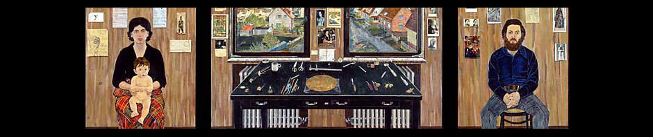
If you look at the top two paintings in the grouping of George Tooker on this blog, you will see “The Subway” and “The Government Bureau.” From this corner of the world, my sense is that if these aren’t great paintings they are quite close! So, this is quite an achievement, or so I think.
Your point about Hopper is interesting, but what would you make of the critic who describes Hopper’s work as illustration?
Dear Sylvia:
Lovely to hear from you.
I think if you saw George Tooker’s show at the National Academy you would have gotten a somewhat different impression. Seen altogether, the work is more complicated. Also, his art does change and become warmer, so to speak. I think, though, that the two paintings that began my blog, “The Subway” and “The Government Bureau” are really quite monumental and magnificent. ‘Cold’ it might be one way to describe it, but I think I would say alienated, disillusioned, withdrawn….something like the feeling of Beckett and Camus. I think he really captures this sense of entrapment and in rendering this emotion or human state, he really has hit it. Though relatively small, these two works provide an inescapable matrix that we must deal with. Even if we don’t want to deal with this, it seems to me that we simply have to accept this stark reality as a forceful component of modern life.
Having just returned last night, from a two week stay in Italy, I was most interested to read your latest blog entry concerning “The Two Georges.” It goes without saying, that Morandi was on my mind, even more than usual, as I stood in the country where those forms and his unparralled sense of color were born. Both Georges possess that unique ability to create order and poetry out of the chaos around them, resulting in work that resonates on so many levels.
Thank you for taking the time to share your thoughts, expressed with such clarity, with me.
Simon,
After re-reading the blog I was genuinely moved by the story about you and your grandson. I have a 6 yr. old myself. That is what it is all about! That is what is great about art, the way it affects different individuals in different ways. There is no absolute ,,, and it makes one feel little to judge to quickly. WHO AM I? WHAT DOES IT ALL MEAN ANYWAY? It’s fun to speculate.
I have read all the blog replies to the Morandi/Tooker dialog and I am not going to address individuals but rather some of the points I found questionable. Tooker should definitely not be dismissed simply because of his subject matter. I realize that we are living in a “Happy Meal” world but to deny the colder harder faces of human existence is truly tragic. My problem with Tooker is not his message, but how he conveys it. He doesn’t really provide me with a greater depth of understanding or feeling than I already have, His work is like “packaged meat”. You know it is bad, but you don’t see the slaughterhouse such as Max Beckmann, Otto Dix or Sue Coe would show you. Granted the alienation and coldness of a subway station is much different than that of Nazi Germany or a slaughterhouse, yet that fact doesn’t change the fact that Tooker consciously presents us with a stereotype of the human condition in a contrived manner. That is what really bugs me about his work. If it moves others than I believe he has been successful in his pre-determined mission, but to me this is not great art because I am personally not enlightened by what I have seen.
As for Hopper that is a different story. Regardless of whether or not he worked as a professional illustrator (as did Andy Warhol and Willem DeKooning and many others,,,) it doesn’t matter. His figures. houses and countrysides breathe. He has the touch in his hand. I am a firm believer in a strong work ethic. It can make you a good artist and/or technician but not necessarily a great one. I don’t think it is something you are born with either. I think the great artist learns how to harness their individual experiences from life and manifest them into something that is anything but ordinary. That is is difference between Hopper and Tooker and say Honour Daumier and Norman Rockwell.
My final word on Morandi (and I have seen a lot including the Met show) is that he is good but over-rated. People simply like simple, yet always try to justify it my making things more complex than they are to make themselves feel comfortable about art. That is why there is so much writing about artists on museum walls and that is why many people do more reading then looking. They say you should respect artitst’s such as Robert Ryman (always white*) and Agnes Martin which I understand but will never appreciate because it is too understandableor has no real insight other than the babble created by the art world elite. Damn it, I like thinking and to be challenged. I won’t be force-fed by anyone. Simplicity is a powerful vehicle when channeled by a capable artist. Kasemir Malevich and Piet Modrian are two artists which come to mind. Ellsworth Kelly is not.
* please excuse the pun, but I had to do it
Hello, Simon–a very interesting posting. We saw the Morandi but unfortunately missed the Tooker. I loved the Morandi, and your insights about him speak to me. I was struck by the cold, almost Hopperesque light he used against the shadows falling from the figures. The figures (bottles, etc.) seemed totemic yet humble, bunched together against the solid sky, looking vulnerable. Very beautiful, lonely works, I thought.
I saw some outstanding wood engravings by Terry Winters at the Met last weekend.
Curtis,
Terry Winters is good. better than most, but once again formula. He is making a product to sell. He has a great feel for materials , luxurious yes… but is it art? what is he really saying that you can’t realize more fully by looking a skin cell under a microscope?
Curtis,
I regret my earlier statement to about Terry Winters. He works very hard and is a very good artist. I also feel like I violated a personal message from you to Simon. That’s one of the things you have to be careful about with a blog,
On another note, I am having an open studio today Sat. June 13th from 5 – 9pm, My studio is located at 925 Bergen (btw. Franklin and Classon). I am in studio 402. There will be over 20 artists in the “Monti” building who also will be participating. I invite all that read this to attend.
PS: I have one work that I did directly in response to the Morandi exhibition that was at the Met last year.
Dear Gary Patton:
I usually add to the blog at approximately two month intervals. It’s kind of a running visual diary on issues and shows and art that seems important to me. It might involve enhibitions I have seen. I have received many suggestions from readers wanting weekly entries. I suppose this does make sense. For now, I am sticking with rather longer discussions, which seem more thought out as ideas or statements.
There are additional comments in the Reflections section of this website. I chose 10 works of mine to write about. I think you will find this of interest.
Vivian Bailes says:
Hi Dear Simon, Thank you for keeping me “in the loop.” I’m flattered to think that you think I have the capacity to make an intelligent comment re your deeply insightful & artistic info. I CAN comment that I smiled that you & grandson bond w/art. Love from Florida
kiciedeni Says:
June 4th, 2009 at 9:09 am edit
Sweet blog. I never know what I am going to come across next. I think you should do more posting as you have some pretty intelligent stuff to say.
I’ll be watching you
Ulrich Littmann Says:
June 5th, 2009 at 11:10 am edit
Ulrich Littmann was the Director of the Fulbright Commission in Germany for 31 years. 1963-1994.
Hello Simon,
was out of touch with the environment, see your blog just now – sorry for the delay. I can still spend hours to look at the Tryptich and discover new aspects related to your experience as a traveller and as an artist. Old Bill Fulbright would be delighted to see what his idea of educational exchange could produce! Yours is more of a reminder of a great American than many books that have been written about him. Thank you — and go on!!!
Ulrich
interesting commentary on “illustration” issue- could make for a lively panel discussion
Audrey Frank Anastasi
I liked your comparison between Tooker and Morandi. Both wonderful shows. I thought the Tooker/Blakelock show was just the kind of show NAD should be putting up. I’m usually at the Met every Saturday eveing and saw the Morandi show many times. A real poet, with a subtle moving color. Morandi also has allot of affinity with Bonnard which was a terrific show in the same setting. Both artist lived in their own hermetic world which they were able to bring us into. It is easy see their beautiful color sense but to me their compositional placements were just as exciting. The current Bacon show is good but not as compelling, to my aesthetic,, as Morandi and Bonnard.
Peace, Richard Sloat
Richard Sloat comments on “The Figurative Tradition and Illustration,” the subject of Blog # 1:
Comment:
What makes illustration different than fine art is that it is “read” rather than “felt”. One looks at Rockwell’s pictures and says “those people look so contented”, and can imagine a story reading all the visual cues. With Daumier one imagines a story but we also “feel” the situation, experience it. But we should respect Rockwell because he was a wonderful illustrator of American Life as an ideal. This is not as easy as some would claim, try doing it. We need good illustrators, as we need good artists. Lyndon Johnson wanted Rockwell to do his Presidential Portrait but was dissuaded from using him by Lady Bird and others. I feel that Rockwell’s illustration of him was far superior to the academic portrait that eventually became the official Presidential Portrait. As good an illustrator as he was, Rockwell, deserves his recognition.
Dear Richard:
Though I haven’t seen the official portrait of Johnson, I could easily imagine Rockwell’s illustration of the former President as being superior.
This fact still doesn’t bring Rockwell’s very fine illustration into the world of fine arts.
In the discussion of this subject in the previous blog # 1, I tried to explain how the word “illustration” is used to lump together figurative artists. In this way, it is used with a pejoratove tone, sort of like calling someone a communist, until about 15 years ago.
Actuallt, I really like Daniel Genova’s use of the word “window” in defining the difference. Substituet his term “window” for your “felt” and we’re really
communicating.
In literary terms, it would really seem to me to be difficult for the literary equivalent of an illustrator to be a great writer. Someone who writes with Rockwell’s clear facility could be quite wonderful. It would, for this reader, lack something of what is so touching, poetic and mysterious about an amazing piece of writing……………..a window to the soul or to “some bone hard kernel of human existence.”
Just to refuel the fire… I read an article on Alex Katz in the recent Smithsonian magazine and to say he comes across as a bit of a blow-hard is an understatement, but that is besides the point. Although the entire art world clamors for his work as well as that of Andy Warhol, I think of them both as very good “illustrators” but not fine artists with the exception of their early work, Any comments? Just if your wondering… who I like? Today I saw a exhibit of James Ensor at MOMA and it kicked my tookas!