Counterpoint: A blog on the Visual Arts No. 5

Two George’s in New York


I had mentioned to friends and students that they should see the exhibitions of Giorgio Morandi at the Metropolitan Museum and George Tooker at the National Academy.  I suggested that they be seen together.  A good friend asked me what the two exhibits had in common.  I reached for various answers, such as the common interest in form, their innocence, their openness to modernism, a certain pared down depiction of reality and the physical proximity of the exhibitions.  Finally, I realized the significance to me of their name – “George.”  My mind somehow links these two artists together.  Perhaps some future insight will make this juxtaposition clearer.


“Nothing is more abstract than reality.”


                   “I believe that nothing can be more abstract, more unreal, than what we actually see….Matter exists, of course, but has no intrinsic meaning of its own, such as the meaning we attach to it.  Only we can know that a cup is a cup, that a tree is a tree….I have never intended to give the objects in my still life arrangements any particular meanings.”


Giorgio Morandi


A tender and extreme innocence and quest inhabits the magical work of Giorgio Morandi that was on exhibit at the Met.  The paintings are tough-minded and yet warmly intellectual, diffident and hermetic.


One is struck by the immense variation that exists within a seemingly narrow range of subject matter.  When viewing this body of work, we are taken on a long voyage which involves a searching contemplation.  There is a strong interest in space, form and architecture.


A duality exists as objects are depicted with great structural probing and yet there is also a certain awe, lack of strategy and no sense of rendering to Morandi’s work.  The lines, which  sometime waver and appear out of focus, speak to the overall innocence of the art.


The paintings, simple and complicated at one and the same time, never lose their mystery.  Actually, they are as mysterious as they are simple and locate themselves on the opposite end of the spectrum from illustration.  They exist for themselves.


Matvey Levenstein, in December’s Art in America, writes movingly of Morandi, quoting the artist – as a:”believer in Art for Art’s sake rather than in Art for the sake of religion, of social justice or national glory.  Nothing is more alien to me than an art which sets out to serve other purposes than those implied in the work of Art in itself.  I ….have never set out to illustrate anything at all programmatic in my work.”


Levenstein quotes Isaiah Berlin on the “Naïve” artist as being rare in modern times.  For them “art is a natural form of expression; they see what they see directly and seek to articulate it for its own sake, not for any ulterior purpose, however sublime.”  Shiller writes of the naïve poet that “the object possesses him entirely….He is concealed by his works like God by the world He has created.  He is the work. For the work is himself.”


morandi    


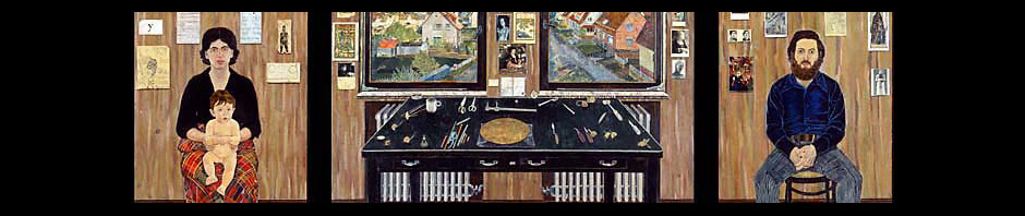
George Tooker’s recent retrospective at the National Academy shares a purity and innocence with Morandi.  The work is highly human and yet very open to modernist ideas of space and psychology and composition.  The paintings use art historical imagery and yet refresh and invigorate traditional figurative directions to depict a contemporary psychology.  Detachment and distance is frameworked within an architectural setting.  Our solitary presence is invoked, a lonely journey to find our truth, possibly on planet Earth, or as a metaphor within our urban malaise.


 Tooker’s painting, The Subway, is a deep and striking work, upending, disturbing and relentless in the repetition of form and movement.  We are trapped somehow in this underground world, fated to pursue and search out meaning within some faraway and irrational world order.


Similarly, The Government Bureau, shares Tooker’s repetitions of form, architecture, creating a foreboding and weirded- out presence.  As with The Subway, the influence of early Italian art, perhaps Piero, is clear but the work is charged with a modern and existential presence.  In certain of Tooker’s images, we are left to our own devices within a less and less rational and certainly detached world.


This dream-like element shifts a bit as the compositions and mood changes.  Singular figures appear or are shown with still life.  Or, sometimes they are depicted listening to themselves.  We are brought onto Tooker’s stage and world and presented with a highly human, yet sometimes disturbing world.  A formidable presence, within the figurative tradition, both traditional and modern, is strongly exhibited.


“I am after painting reality impressed on the mind so hard that it returns as a dream, but I am not after painting dreams as such, or fantasy.”


George Tooker


tooker    


On December 31, I revisited the Tooker show with my grandson, Adrian, who is seven years old.  It was the second exhibition I had taken Adrian to see.  The first was of prints of Albrecht Durer at the Museum of Biblical Art.  I knew that Adrian would respond to Tooker’s work….or at least I had a strong hunch.  We stayed for two hours and were both fully absorbed.  Adrian copied some of the work and did a wonderful drawing of Pot of Aloes.  I mentioned to him that the man in the painting playing chess (A Game of Chess) seemed to look like Georg Tooker.  Adrian spent a good deal of time looking at the painting and said that the man looked a bit “frantic.”


Something finally clicked in my head about Tooker and Morandi.  It was a certain innocence and pared down reality that they shared in common.  Two wonderful, thought-provoking shows!


Posted in Counterpoint | 23 Comments

Counterpoint: A blog on the Visual Arts No. 4

A Car Ride to the Palmer Museum of Art: Visiting The Fulbright Triptych


On December 9, Virginia Bonito, an art historian and former curator of the Seavest Collection, Marshall Price, curator at the National Academy Museum of Art, and Jhumpa Lahiri, a wise and gifted writer, accompanied me on the four and a half hour car ride to the Palmer Museum of Art at Pennsylvania State University. These three, along with about twenty other contributors including the composer George Crumb, the actors John Turturro and Alvin Epstein, and the art historian, Colin Eisler, will be taking part in a really exciting project. (Also participating in this upcoming publication are Anthony Doerr, author of The Shell Collector and the psychoanalyst/novelist Phillipe Grimbert, whose book, Memory, was recently made into the haunting film, A Secret.) 


For the last few months, Milkweed Editions, an independent publisher located in Minneapolis, has been putting together an anthology of writing based on my painting, The Fulbright Triptych.  In the book, this major, fourteen foot painting will be seen and written about from a variety of points of view: through the lens of an art historian, a novelist, a composer, a pianist, a critic, a psychologist, etc. Some essays that were previously published, including works by Guy Davenport, Rudolf Arnheim, John Russell, George Tooker, Tom Messer and Albert Boime will also be a part of this publication.


The car ride with these three bright, articulate individuals, along with the viewing of the painting at the museum, turned this visit into a long, intense, mysterious and richly rewarding day. We spent about three hours at the museum where the painting was set up in a special viewing room.  I spoke extemporaneously, answered questions and met some of the museum personnel, including the registrar Beverly Sutley and the museum director, Jan Muhlert, as well as two Palmer Museum curators, Joyce Robinson and Leo Mazow.


I had last seen the painting in 1999-2000 when it toured the country as part of a retrospective exhibition. The triptych is a grand and highly personal work and has many complicated themes weaving through it, among which are those of memory and memoir. This emotionally moving visit brought to mind many thoughts about the mystical adventure of the three years (1971-1974), it took to complete this painting. I thought of the journey that led to this picture and my journey since.


I have often reflected on the many aspects of a work of art that aren’t always clear to the artist while the image is being worked on. Curiously, sometimes, this becomes clearer the day after the painting is complete! Sometimes, it is the year after. And sometimes many years go by, in this case thirty or more, when some unexpected light shines on your effort.


Just a few days ago, reading a wonderful essay by Alfred Kazin about Herman Melville, I began to realize certain secret and surprising themes that are present in The Fulbright Triptych. How curious and wonderful!


Posted in Counterpoint | 21 Comments

Counterpoint: A blog on the Visual Arts No. 3

Ana Maria Pacheco and Antonio López García: Bookends in Boston                                     


 Ana Maria Pacheco’s work was familiar to me in reproduction only.  I owned two small books on her work.  One of these, a book of collected essays on her art, I had recently lent to an editor for use as a reference for an upcoming project.  Afterwards, I realized that I should purchase a second copy of this book for my art library so I went on line to search for one.  When I googled “Pacheco”, I read that a major work of the artist was presently on display in Framingham, Massachusetts, a suburb of Boston.  So, on the way to see the Antonio López Garcia show at the Museum of Fine Arts in Boston, I stopped to see Pacheco’s sculpture.


Presented at the Danforth Museum, Ana Maria Pacheco’s, Dark Night of the Soul, is quite a major work of contemporary art.  Displayed in a darkened room by itself, the piece consists of 19 sculptured figures The sculptures are large, compelling, deeply abstract and emotionally involving.  They are theatrical, mysterious and are illuminated and choreographed quite dramatically.  They literally stopped me in my tracks.


The figures, seen as if in a dream, depict a rite, one located in the world of Saint Sebastian.  The action displayed is both clear and unclear at the very same time.  The scene is quite realistic and yet stylized and particular at one and the same time.   The intensity of the central action has a strong effect on the outer figures within the tableau, the onlookers.  Also, viewers to the show are forced into the very same position as the sculpted onlookers, a kind of complicity to some act of torture or to a rite being performed. 


The figures have a remarkably tactile presence and also a feeling of being apparitions in a dream state.  They are archaic and modern at one and the same time.  An abstract/formalized presence characterizes each face within the group. One can sense the influence of puppetry/marionettes and contemporary abstract sculpture and yet the result is modern, contemporary and highly human.  Gesso-smoothed surfaces and facsimiles of real teeth push this juxtaposition of abstract and dreamlike form, providing an eerie counterpoint.


As in all major work, this art is hard to pin down.  It evokes references to literary sources, poetry, psychology, dance, myth, gravitas, contemporary illusions to war, Abu Ghraib and transcendent visions that go all the way back to early Greek Art.  So much is channeled here, so many ideas are cemented together and yet the look of the work seems to have no strategy connected with it.  In other words, it holds its mystery and does this despite the labor and design that it took to put this work together.  When viewed in reproduction, a possible second thought for this viewer had to do with a slight sense of a faux Primitive element.  In person, the deeply charged sense of the art is what one perceived….a powerful and visionary work!


Speaking of channeling… the López show in Boston is stunning.  I have known the artist’s work since 1968, when I first saw a powerful exhibition of his at Staempfli Gallery in New York.  (Viewing that show at Staempfli is what compelled me to approach that gallery with my own work five years later.)  The characteristic that speaks to me the most here is the ability to re-invent or re-vitalize the figurative tradition with a modern or modernist point of view.  The work isn’t a re-telling of realism, circa 1875, but wonderfully and naturally brings humanism in touch with contemporary themes.  The presence of the surreal,  with dream states, visions, collages, found objects, meditations on time, an almost existential aura, the influence of Picasso, all add to Lopez’ humanism and quite extraordinary painting abilities.  At the time (1968),I found it interesting to read that López felt his work could be shown side by side in exhibits with his non-objective counterparts.  In terms of American realism, such a viewpoint would have been considered wildly extreme.  Yet, this attitude represented an open-ness to contemporary thought, which was also reflected in his choice of subject matter…..from a dinner plate showing the ends of a meal to a forlorn bathroom, to a couple making love on a city street (or in a dreamscape?).  So, also, he made this painter aware that the subject matter of art was far wider than academically pre-conceived.


These paintings and drawings look back to Velasquez and Goya.  There is a way that López deals with the dark, close-valued half-tones that calls to mind Velasquez.  It reminds me of Edwin Dickinson as well, an artist who, surprisingly, López wasn’t even aware of. A student of Dickinson recalls the artist holding up his hand and pointing to the area between his thumb and first finger and remarking that one should be able to see one hundred half tones in this location.  These very same half tones in López’ works are dazzling.  The slightest difference in light, whether in value or warm and cool is hypnotically conveyed.


At its best this work channels up some spirit or mystery, some haunted aspect of the everyday.  In a sense, this is a meditation on time, the time that lies in the pictorial space and the time that the image takes to be born.  The time spent waiting and the ability to wait are conjured up.  A tremendously inspiring artist, it appears as if López has allowed himself whatever time it takes or whatever is needed to provide the meditation and involvement that the image needs. He hides within the image, as his ego isn’t tantamount; he is both chameleon and conduit/catalyst for the subject, which is given the most prominence.


His work is curiously quiet and upending at one and the same moment.  There is a great commitment, honesty and sense of gravitas. Some of the paintings and sculpture take López years to finish. The two standing figures, took perhaps more than twenty years. 


The art exists wholly on and for its own sake.  The surface is worked, re-worked and obsessively attended to – yet not rendered. Robert Hughes states about López work:  “It is the very reverse of academic art and the antithesis of illustration.”


A terrible reality or honesty is depicted.  Curiously, the usual direction in a figurative artist’s growth is reversed.  Usually the path would be from detailed to more generalized, from naturalistic to abstract, from tighter to looser, from the myopic to far sighted, from a demanding detail to letting go.  In López’ later work, the character seems somewhat tighter, more exacting, more ordered and naturalistic.  Thus the looser and more surreal earlier work gives way to something simpler, more precise and a bit more narrowed up.


A number of works stand out: Atocha (1964); The Rabbit (1972), El norte de Madrid desde “La Maliciosa”) (1964,) Maria (1972), A view from the Balcony , Terraza de Lucio (1962-1990), Standing Male and Female sculptures, (1968-1994), The Toilet (Taza de water y ventana) (1968-1971). 


One work, however, The Cupboard, El Aparador, (1965-66), seems to roll all of López’ magical hand, eye and heart into one work of art.  This is a moody image, mirrored in sooty darks and very close-valued.  Memory permeates the air.  Perhaps the memory comes from these very objects and what they have seen.  The composition is beautiful, hidden and hermetic.  One has to reach into the picture.  The dark tones, especially at the bottom, are incredibly close together.  This painting breathes with a sense of time past…… a virtuoso display of texture and light.  There is even a reflection of a chandelier and what looks like a reflection of the artist painting on the upper left.  What might be trompe l’oeil becomes an illusion of spirit, mood, memory and time.  As in all great art, this painting can’t be contained by a single criterion.  It is the depiction of a family’s growth and shared history.  And yet, so much of this is accomplished, within the world of contemporary art and a rich, deep, touching humanity is gloriously felt and displayed.  A haunting and major work!  And, as in many López images, which are calm and dis-quieting, a tenderness and brutality combines in an unnerving caress.


Posted in Counterpoint | 7 Comments

Counterpoint: A blog on the Visual Arts No. 2

Davenport, Courbet, Balthus


In 1990, a monograph on my work was published by the University of Arkansas Press.  This was a very exciting project to work on and was the brainchild of the poet, Miller Williams, who I had met at the American Academy in Rome.  When the book was completed, I sent it to various critics and reviewers.


One of the most wonderful of the ensuing interchanges was with Guy Davenport.  I knew the writer as the author of a remarkable work, A Balthus Notebook.  This very singular book, something like a chapbook, was special and unlike any book I had read on an artist.  What I didn’t realize at the time was that Davenport, primarily a literary critic and essayist, was known for his highly unusual ‘voice’ and musings/conjectures, especially in The Geography of the Imagination.


The first of our correspondences was extremely amazing.  Even in a letter, Davenport’s prose jumped off the page, with remarkable ‘jumps’ and extraordinary leaps of the imagination.  His comparison of my major painting, The Fulbright Triptych, to the epic poem, A, of Louis Zukofsky, demonstrated Davenport’s remarkable gift for links and analogies that, perhaps, few other writers possess.  See Simon Dinnerstein – Guy Davenport correspondence, 1990.


 My correspondence with Davenport lasted for 15 years, until his unfortunate passing in December of 2005.  He was, indeed, a very wise man.  When I sat down to write my letters to him, I had to have all of my thoughts and intuitions sharpened and in good stead.  In a sense, I had to do a good deal of intellectual sit-ups, run around the block a few times and generally be in very good shape.  In our present ‘email generation’ we become accustomed to distilling our thoughts and writing short ‘jottings’. Really fine letter-writing is sadly an activity that is fading away quite speedily. Davenport’s intelligence inspired me to present a correspondence that was the best possible representation of myself.  See “A Balthus Notebook,” 1989, The Ecco Press, four excerpts.


I found myself thinking of Guy recently when I visited the striking exhibition of Gustave Courbet at the Metropolitan Museum.  One of the themes in Davenport’s writing had to do with the way artists ‘correspond’ with each other.  To put it another way, one artist might relate to another, say Balthus to Piero and there is a form of a dialogue set up between one and the other.  So, certain aspects of Balthus, in a figurative composition, for example The Passage du Commerce-Saint-Andre (1952-1954), one could argue would be a startling ‘take’ on the early Renaissance work of Piero.


The Courbet show in New York was probably much different than the one that had been shown in Paris since two major paintings, The Painter’s Studio: A Real Allegory Summing up a Seven Year theme of My Artistic Life (18550 and A Burial at Ornans (1849-50), were deemed too large and too valuable/vulnerable to travel.  Nevertheless, this was a very interesting and in part, scintillating show.  Courbet is a very gritty realist and his work has both a traditional feel and something very modern about it.  I find the combination of these two directions to be quite dramatic and intense. To return to Davenport’s theory, it seemed that Courbet was at his most intriguing when his work showed the ‘correspondence’ with Balthus.  To be even more direct, about 90 percent of the work that stood out to me for their bite, intensity and modernism, almost seemed as though Courbet could have been influenced by Balthus!


Courbet’s painting of his sister, Juliette Courbet (1840) made me think that he had seen Balthus’ Therese (1938) at the Metropolitan Museum.  Courbet’s image of Proudhon (1853) can bring to mind Balthus’ depiction of children, especially The Blanchard Children (1837) or even Girl with a Cat (1937).  Elements of Courbet’s landscape, with its particular craggy flatness made me think of Balthus’ The Mountain (1937), a huge and transformative painting in the Met’s collection.  One could even argue that, in some cases, the physiognomy of these two men seem to merge with  Balthus’ King of Cats (1935) and his Cathy Dressing (1933) veering close to Courbet’s The Cellist (1847 and The Wounded Man (1844-54) and The Man with the Leather Belt. (1845-56).  Perhaps one of these artists was a ‘time traveler!


Finally, there are an extraordinary grouping of nudes by Courbet which bristle and crackle with energy and electric charge.  Certainly these seem influenced or inflected by Balthus.  One could easily imagine that the lush and totally sensual Reclining Nude (1862) of Courbet must surely draw its inspiration from Balthus’ The Victim (1939-46).  And, Courbet’s sensational Origin of the World (1866) and his quite upending, Sleep (1866 ) surely meet somewhere in Balthus’ The Guitar Lesson (1934) and Alice (1933).  This latter quartet shares a daring and provocative ‘pushing the limits’ in art.  Curiously, these works, deemed ‘difficult,’ were and are, rarely shown.  They reside within the realm of the fine arts but, in their own ways, lean very close to the pornographic.  What saves them, in, say, Courbet, is the way his understanding and caressing of the female form combine with his sheer ability  to manipulate paint.  One is impressed by the singularity of these images and their transgressive, wild extremism.  They feel both modern and very provocative.


A postscript to this argument comes in the form of an intriguing essay by Sebastian Smee on the painter Lucian Freud.  Smee quotes Freud admiringly speaking of Courbet’s “shamelessness” and a painting such as Freud’s Naked Girl (1966) would surely bear this out.  Guy Davenport’s conjecture strikes one as true and such a correspondence seems even stranger and stranger when it mysteriously comes from the future.


So, one could almost say, with humor, that the most striking images in Courbet’s exhibit showed that he had been looking at and giving a great deal of thought to the world of Balthus.


courbetbalthussmall1.jpg 

Posted in Counterpoint | 2 Comments

Counterpoint: A blog on the Visual Arts No. 1

The Figurative Tradition and Illustration


Having been a student and an artist for more than forty years, I have been struck by the use of the word Illustration. In the past 10 years, especially, critics for highly touted art journals, including The New York Times, increasingly use the words illustration and figurative art interchangeably.  To put it another way, illustration is used pejoratively to lump together most figurative artists.  The effect is analogous to McCarthy’s indiscriminate use of the word communist to cast aspersions on an individual’s character and political profile.

 As an artist working in the figurative tradition, the use of the word illustration has the uncomfortable effect of chalk being driven over a blackboard. In a slightly different manner, at one time the denigrating reference for figurative art was the use of the word academic.

 There used to be a clearer understanding of the term illustration.  It was the depiction of form rendered by illustrators to depict incidents in books, journals or magazines.  The world of children’s illustration is full of top flight illustrators.  First-rate illustrators, such as Nancy Ekholm Burkert, Maurice Sendak, Eric Carle and Leo Leoni have produced dazzling work.  Some of the stories they depict were written by them, some were written by others.  Some of these pages are so well-done that I have often wondered what the “fine art” of these artists looked like.  In the case of Nance Burkert, I actually came across a very interesting book which showed her non-illustrational work (The Art of Nancy Burkert, Peacock Press, 1977).

 Fine artists sometimes used their skills to increase their income by taking on work as illustrators.  They worked for magazines and journals illustrating stories and daily events.  These artists were probably the exception and ultimately, most illustration was done by professional illustrators.

 An analogy could be made between the world of illustration to fine arts and the world of journalism to fine literature.  Some journalists have remarkable abilities to depict events and life.  Journalists such as Truman Capote and Tom Wolfe have written about very particular events…..a particularly trendy new Left party…..a trial.

 Norman Rockwell considered himself an illustrator.  He probably thought of himself as a top-of-the-line illustrator.  He certainly had the “chops” so to speak.  A recent show of Rockwell’s work at the Guggenheim Museum was a very clever attempt to further blur the lines between illustration and art.  Perhaps, the show was the wish of the curator, Robert Rosenblum, to get the viewer to re-think the differences between illustration and fine art.  The location of the exhibit at the very modern and hip Guggenheim thus provided the backdrop (rather humorously) for this revisionist take on figurative art.  Perhaps another aspect of this rather clouded issue is that Rockwell, as an illustrator, might be considered a much better painter technically than Hopper, his direct contemporary.  Even if one could argue this point, Edward Hopper is clearly a great artist and Norman Rockwell is still an illustrator (one with enormous facilities, but nevertheless, an illustrator).

 Should all work reproduced in a magazine be considered illustration?

Some magazines reproduce work by Eakins and Homer.  These images, however, were created long before the magazines existed and have nothing to do with the term illustration.  Some journals might produce images by Antonio López García or Lucian Freud to illustrate an article.  These images were not originally produced as illustrations. They had their own reason for being born and were inspired by the artist’s keenly felt vision.  Rockwell, on the other hand, had one or two week deadlines for his covers of the Saturday Evening Post.  His images clearly had to do with anecdote and contemporary, weekly events.  He was a whiz at rendering scenes that brimmed with a certain humanity and American optimism.  Unfortunately, one could argue that these images come close to the sensibility of the world of Soviet Realism. His scenes are often a comfortable, cloying take on the America that never existed. This is akin to the Republican Party’s reference to American Family Values, a way of life that exists for a sliver of our population.

 Every now and then, work that appears in a newspaper or a journal transcends the genre. In literature, certain books by Dickens and Dostoyevsky were written to be serialized in newspapers.  However, reading A Tale of Two Cities or Crime and Punishment in book form is really wonderful as they are big works, full of complicated ideas.  They just began life within a newspaper format. Bergman’s Scenes from a Marriage and Fanny and Alexander were made for television, but they defy the medium to become world-class works of art.

 Andrew Wyeth is criticized by voguish critics and curators as being an illustrator.  This is a highly debatable point, but even if it was the case, certain of Wyeth’s work, for instance Overflow, Night Shadow and Lovers in his Helga series, are so abstract, moody and personal that their connection with illustration makes no sense.

 At the start of his career, the artist Edward Hopper worked as an illustrator.  Some of his paintings can look like illustration.  However, what illustrator could create the moody and iconic works that Hopper’s reputation rests on?  Images such as Sunday Morning and Nighthawks pulse with a great American spirit and poignancy.

 I lived in Italy at the American Academy in Rome for almost three years and have traveled and had the good fortune to see a great variety of art.  Many of these works depict scenes in the bible.  Many of these paintings did not move beyond the subject depicted and interest us merely as historical artifacts. Could Giotto then be considered an illustrator?  His work usually narrates some clear cut story from the life of Christ.  Yet, when we see the Giotto’s work in person at the Arena Chapel in Padua, Signorelli at the San Brizio Chapel in Orvieto or Piero in Monterchi, we are deeply moved. They transcend their time and speak to us because of their mystery, abstraction and depth, creating remarkable personal visions.  So even though they depict specific scenes, they represent some of the greatest visual images and works of art that human beings have produced.

 A dear friend and fellow artist says he finds illustration to be very interesting.  Moreover, he says that he enjoys the shear abilities that an artist has to depict form.  He claims that many fine paintings lean on an illustrator’s ability to see form.  I am not sure if he is right, though I have enormous respect for his well-considered opinions.  Perhaps he is confusing facility and art.

 Artists such as Sargent work with a certain brushy liquidity and his heirs have inherited a ‘smack and panache’ to their brushstroke.  Their work brims over with a facility that looks a bit like illustration.  Here, the issue possibly isn’t the look of the work, but a certain lack of depth or visual commitment.

 Stretching the discussion, there are artists, such as Bosch (Garden of Earthly Delights), Balthus and Gregory Gillespie who might, at times, seem to be illustrating stories.  The difference is that their stories are deeply mysterious and poetic and the books for these stories don’t really exist. They probably are located in a fantasy dreamscape within the artist’s imagination.

 Perhaps, the difference between illustration and art lies in the surface issues of the former which produces a certain thinness of form and creates a quick fix or take.  There is a cleverness of form, a turn of a phrase.  Unfortunately, the meal is quickly eaten and not remembered.  It is dominated by gesture and facility.  It doesn’t last and reverberate.

 Basically illustration lacks the complexity, depth and commitment of fine art.  The complicated individuals created by a Dostoyevsky, Hardy, or Coetzee could never be considered illustration.  These characters aren’t a “gloss”. They represent the full measure of a human being.  Their portraits move and are independent; they aren’t marionettes gesturing to invoke some anecdotal event (a Thanksgiving dinner, street demonstration or political event).

 Ultimately, to me, illustration is like pornography.  I know it when I see it.

 My conclusion is that the word illustration should be banned in the writing and discussion of figurative art.  What about a moratorium on the word?


March, 2008

Posted in Counterpoint | Tagged , | 12 Comments